The Journal: The Tyranny of the Perfect Grid
When I was first starting out on my philosophical journey, I had a very specific obsession: I wanted everything to be perfectly symmetrical.
If I was setting up a new digital design, I would spend hours aligning every single pixel to a perfect, mathematical grid. If I was styling a room, everything had to be perfectly balanced on either side of the table. I thought that beauty was a mathematical equation—that if I could just make something completely flawless, smooth, and predictable, it would finally bring a sense of order to my life. I was treating my physical environment like a fortress to protect myself against the messy, uneven realities of the outside world.
But the more perfect I made my designs, the more boring they became. They had no friction. They didn’t catch the eye; they just blended into the background like generic hotel art. They lacked that indefinable quality that makes you stop walking and just look.
The realization that changed my entire approach didn’t happen in a studio; it happened when I started studying classic philosophy and looking closely at how things are actually built in nature.
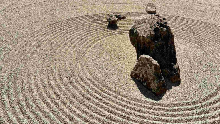
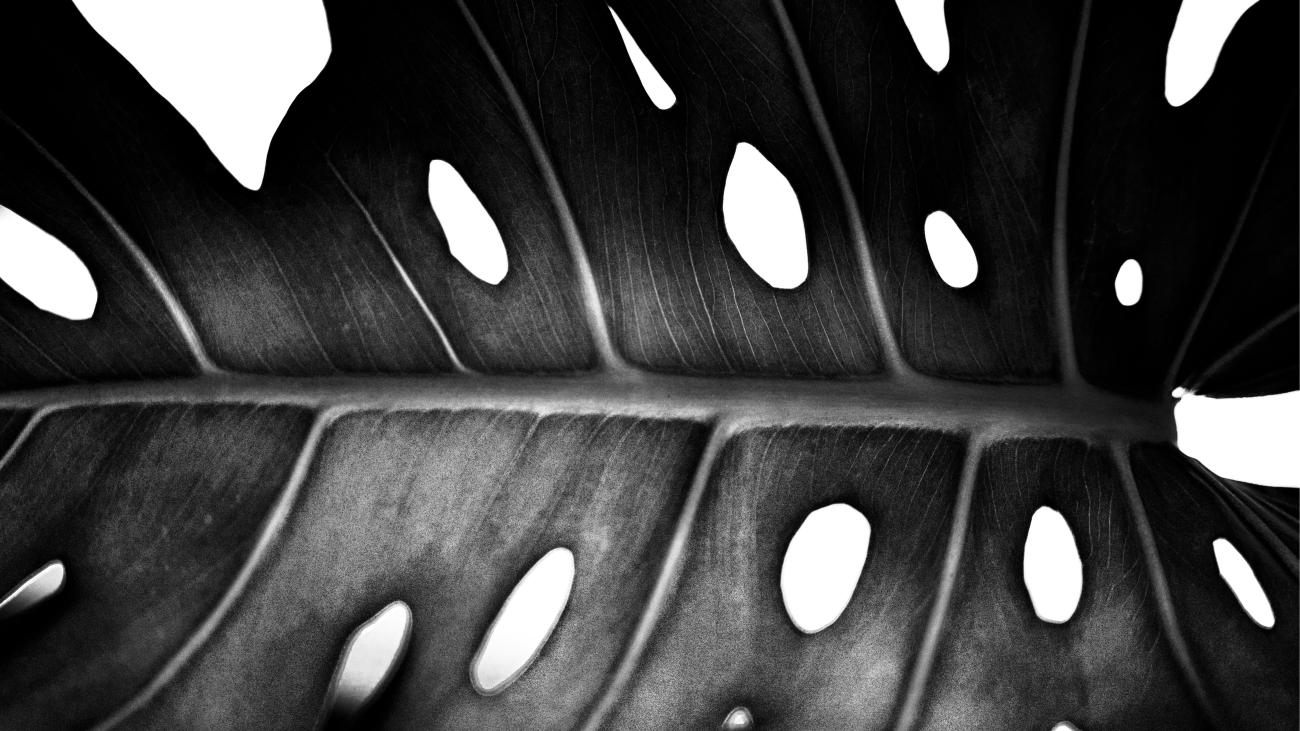
If you look at an old stone house in the countryside, a weathered piece of handmade pottery, or the silhouette of an ancient tree, nothing is perfectly symmetrical. There is always a slight tilt, a rough edge, an unexpected asymmetry. Francis Bacon captured this perfectly when he noted that true excellence in beauty always requires a little bit of “strangeness in the proportion.” It’s the slight imbalance that gives an object its soul. It’s the unexpected detail that forces your brain to wake up and pay attention.
When I applied this to my work, I stopped trying to force everything into a strict, robotic grid. I started leaving wider margins of open space. I experimented with shifting text slightly off-center, letting the composition breathe in unexpected ways.
That single shift changed everything. The work finally felt alive, human, and authentic.
Welcoming Friction into Your Space
We spend so much of our lives trying to smooth out every wrinkle. We want our schedules to be flawless, our habits to be perfect, and our homes to look like sterile digital renderings from a catalog. But a home with no imperfections has no character. It feels less like a sanctuary and more like a showroom.
If you want to bring an authentic, human sense of balance to your workspace or home this week, try making a few deliberate styling choices:
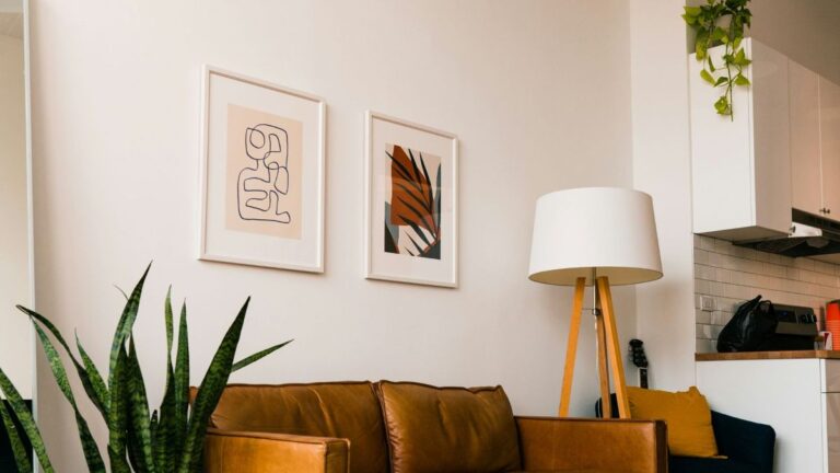
- Break the symmetry: Walk around your room and look at your shelves or tables. If you have objects lined up perfectly, try shifting them. Move a stack of books slightly off-center. Pair a clean, structured frame with an organic, uneven object like a piece of raw stone or a handmade ceramic bowl.
- Respect the empty space: Don’t feel the need to fill every square inch of your walls with patterns or furniture. The quietest, most sophisticated rooms are those that aren’t afraid of wide, open negative space. Let a single, striking piece of framed prints wall art command an entire section of a wall by itself.
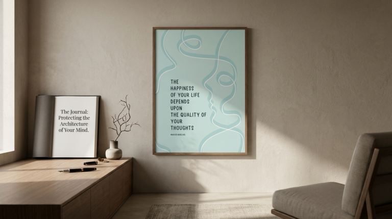
- Anchor your perspective: Mount a piece of high-contrast typography—like our “Strangeness in Proportion“ print—right where your eyes rest when you are sitting at your desk. Let it serve as a daily visual reminder that your life doesn’t have to look like a perfect, unblemished grid to be beautiful.
Your home is a living canvas, not a corporate office. By choosing art and layouts that embrace texture, unique proportions, and honest human character over hyper-polished perfection, you aren’t just decorating—you are building a space that reminds you to breathe, accept the imperfections, and find genuine peace in the beautiful, uneven rhythms of your life today.